Pearson Reporting Platform
Details
Overview - We need to make testing results approachable to a wide array of users, spanning from teachers all the way up to a state-level stake holder. Allow the data to be seen at a high level while still supporting a detailed drill down.
My Role - Lead all design and build consensus within the reporting team, engineers, product owner all the way up to the VP level. Also ensure it operates seamlessly within the parent platform that was being designed in parallel.
Challenge - Balance new features and more intuitive design with old expectations of our clients and users. Focus on innovation with very little front-end support and a very aggressive timeline.
Approach - Attacked at a per-report level design while recognizing context of that wide user base. Allowing old critical reports to be supported while bubbling up results to allow for status at a glance and still supporting drill down details.
Discovery - Review the initial old platform. Identify not only what was challenging from a user's perspective but also what was difficult to support from the engineering side.
Vision - Meet every day. Design every day. Present data in a visually engaging manner to allow all users an easy path towards their decisions and desires.
Requirements - The old system was the requirements, while discovering competitors features and the evolving desires of product owners, sales and VP level executives.
Framework - Work agile UX. Stay abreast of the platform itself as it evolved and was constantly changing with new requirements and new contracts were being sold. Dynamically be ready to design around constant presentations involving live, customer specific data and features.
Design - Whiteboard first. Crank it out in Photoshop at a higher fidelity. Work in parallel with the visual designer. Introduce color to allow a clear understanding of deep data. Create rapid interactive prototypes to allow referencing to engineers for their jira tasks as those tasks were prioritized. Sit in multiple stand-ups weekly to ensure availability if engineers had questions about the designs. Also frequently review with the company's accessibility team to ensure a compliant end product.
Refinement - As timelines and customer demands changed, allow for rapid design adjustments without compromising the parent platform or other related interactions and user flows.
Outcome
Impact - Reporting always tested well with end users regardless of the test audience. The use of color and the interactions were intuitive. The product was being demo'd and sold and the state level and the Department of Defense Education client.
Additional Shots
One page layout. Both sections displayed.
One page layout. Both sections displayed.
One page layout. Both sections displayed.

The top section of the one-page design allowed all users to absorb test results from a very high level. As action areas were identified, the user retains context as the lower section reveals itself and its drillable details.
One page layout with collapsible focus.
One page layout. Both sections displayed.
One page layout. Both sections displayed.

The top section shutters up as the drill down occurs. The user never loses context and never has to worry about shuffling between pages.
Data Viz Flyout Details
Data Viz Flyout Details
Data Viz Flyout Details

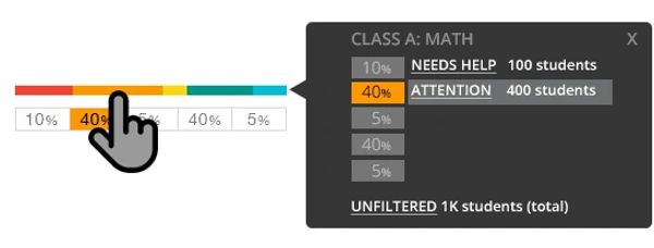
Keeping decision-making data at the user's fingertips was paramount to engaging the user. Data was kept in intuitive reach of the users focus, role and associated tasks.
Messaging and Requests
Data Viz Flyout Details
Data Viz Flyout Details

As the product and parent platform evolved sticky functionality, like messaging, had to remain consistent so elements weren't hidden from a user's focus while not being too intrusive.